Manuskript has been critiqued a lot about its “ugly” clustered interface. Things are not perfect yet, but I’ve put a lot of work into that, and overall it looks much better.
A few recent improvements
Following is a display of some of the improvements that have been done to manuskript’s interface. Some of those are quite recent and will be released with manuskript 0.6.0. Which means you can test them on the develop branch.
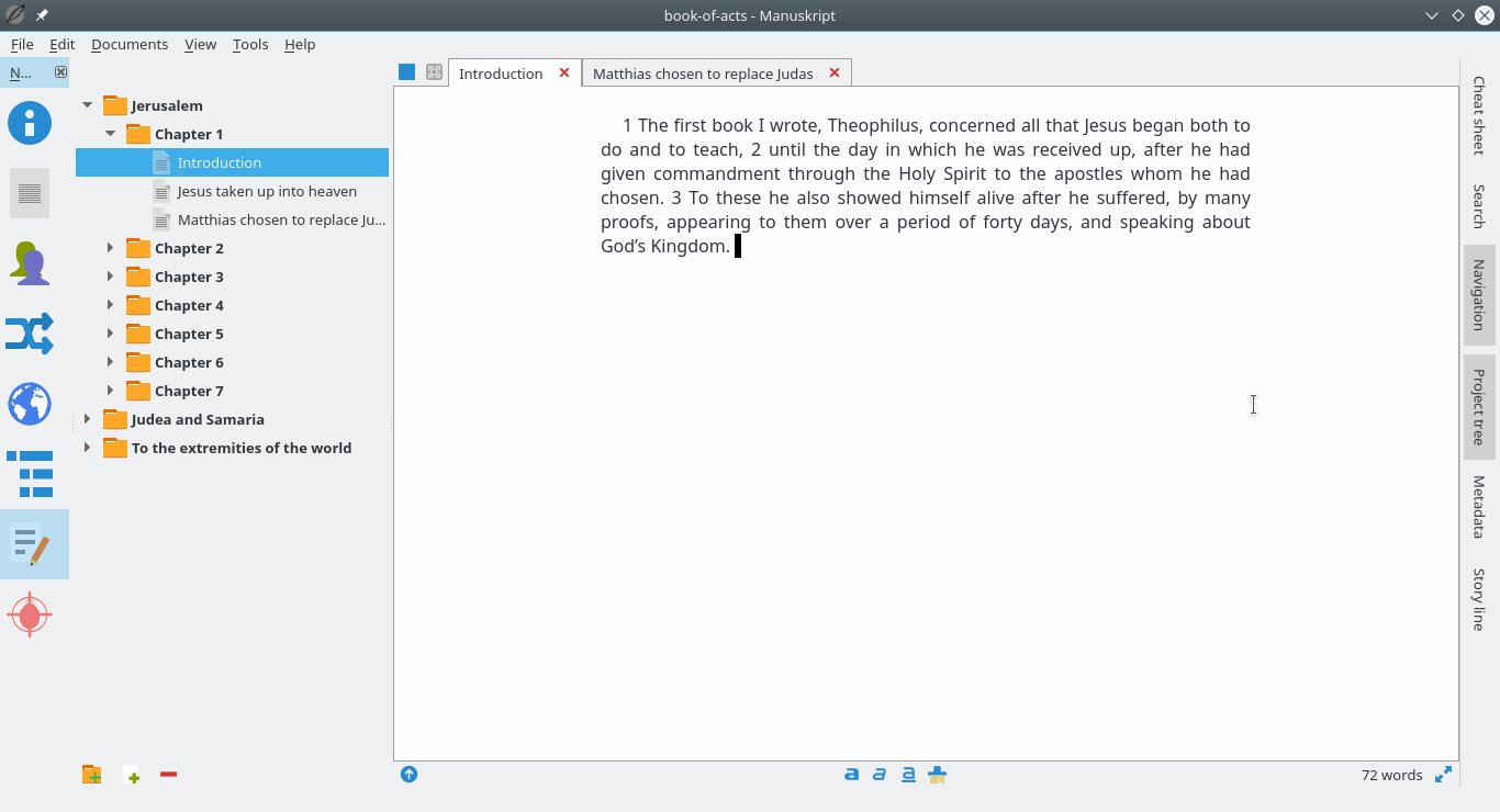
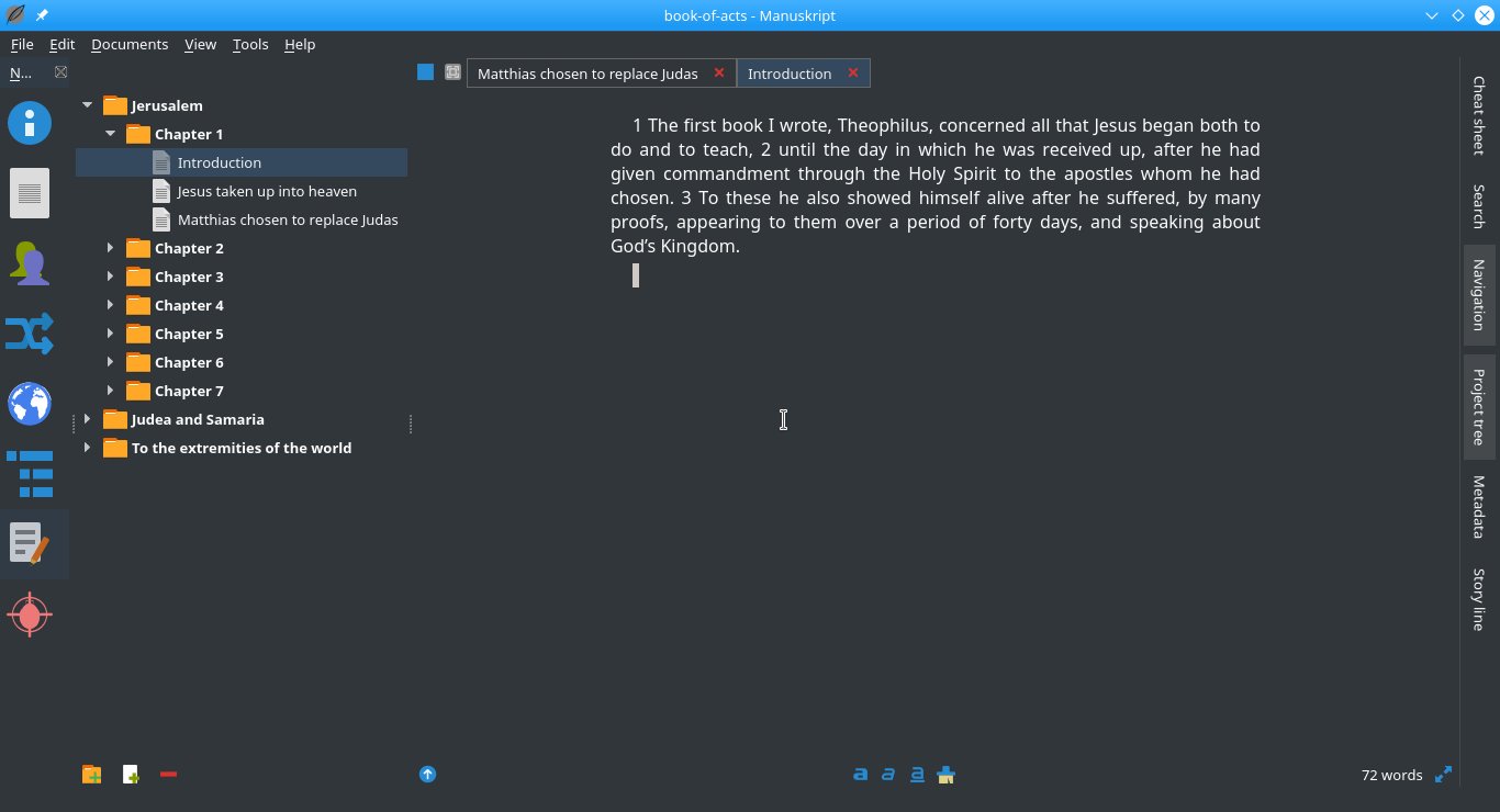
Navigation
Icon menu on the left, and much lighter tabbed interface for the documents. Compare to the old interface.
Transparent background editors
You can even go further and have transparent background text editors, for even less clustering:
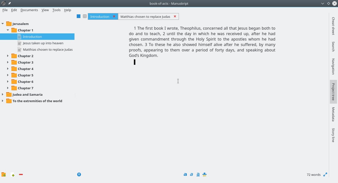
(Maybe I’ll even remove the tab bar in the future)
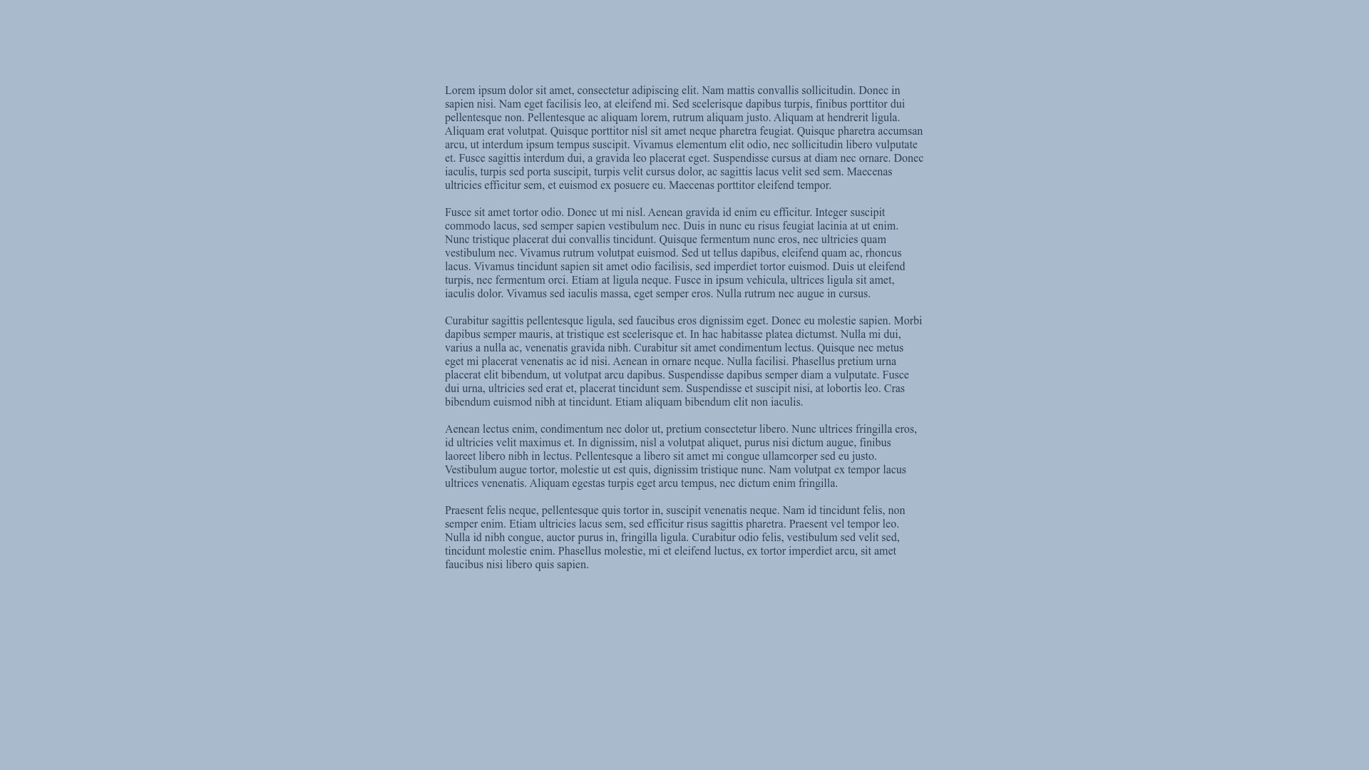
Customizable full-screen distraction-free editing
This is not new, but just in case… You can write in with no distractions, in a fully customizable environment. There’s also a screen locker to help you stay at your work.
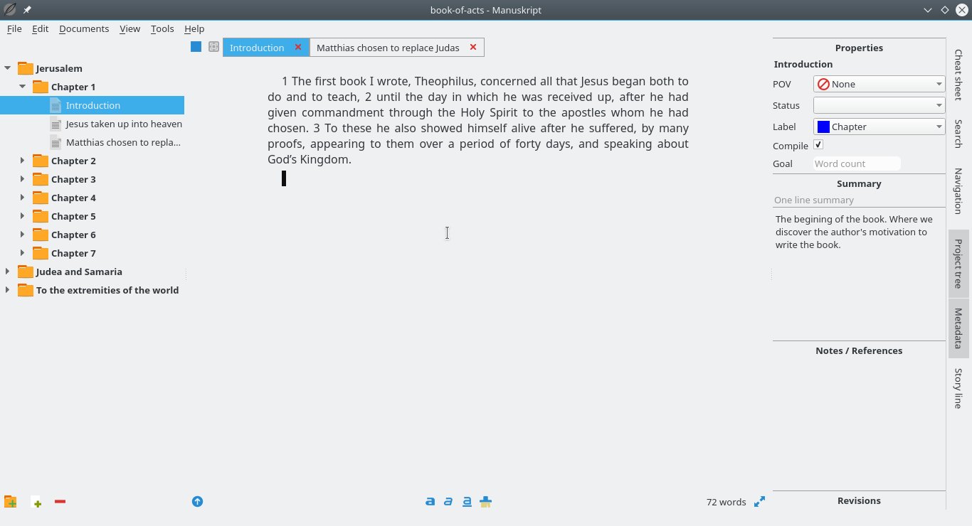
Metadata pane
The metadata pane is also much more discrete than it was in the past.
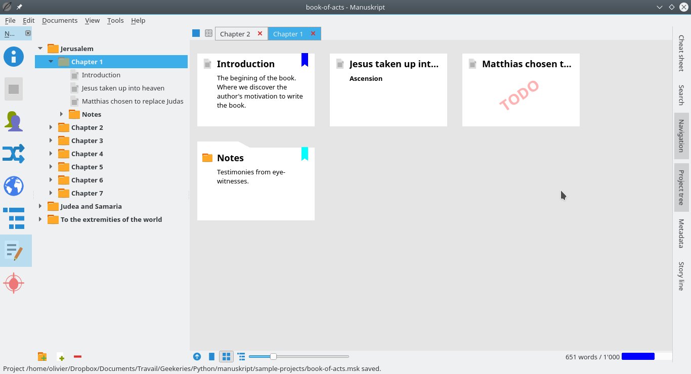
New index cards look
The old index cards were once described as Windows95-y. I agree. The new ones have a modern flat design.
Desktop theme integration
Manuskript uses the Fusion style, it does not use native look-n-feel. This will be a problem for some. But it allows to have a uniform look of manuskript on every platform, and therefore better fine-tuned control.
That being said, manuskript adapts quite well to your color scheme:
A work in progress
Right now, the part you’ll spend the most time in — the Editor — has been quite improved. But many parts of manuskript still very much need a lifting. It will come. And your help is needed: if you have any suggestions, they are most welcome!
So, what do you think of it?
bien
Hello i need to help